Minimalist Design, because less is more

New web design trends are here, but are they here to stay? It's always been there; the simplistic nature of minimalist design. The trend over the past year or so now has been based around flat UI styles, where designers have been sticking to simplistic layouts and limited colour palettes.
Most design trends come and go. They don't often stick around for a long time because they become over used and out-dated. It now seems that everyone got sick of the eyesores that are rounded corners. Minimalist design is a hard term to explain as it can have a completely different meaning for different people, you might consider it as just creating a simple design, but I feel there is a lot more to it; another layer of complexity to exactly what it is, and I feel this is the reason it seems to be lasting longer than most trends.
When I think of Minimalist Design, the words simple, effective and functional come to mind. I believe that minimalist design consists of these three key factors. It is essentially creating a website that is reduced to a simple, visually-pleasing design that is very much functional and user-friendly. These types of designs are generally much easier to adjust for mobile devices as there is less to go wrong, and you don't usually need to make as many adjustments. More complex design, which solely consists of a large variety of elements, is image heavy and potentially uses design elements such as textures, which are a lot harder to adjust for different device sizes because of proportions and text limitations.
Personally, I really like flat styles right now and try to stick to that sort of style in most of my designs, as we have with our own website. It has been around for quite a while now and caught on pretty quickly, but is it going to look dated a year from now, as with previous "in fashion" designs?
Is this design trend stifling creativity and unique design? Fewer and fewer websites look unique anymore, as more and more focus on a similar style. But there are some real benefits; these trends wiped out the trailing cursors, coloured scrollbars and terrible bevelled rounded corners. I actually thank Microsoft (yeah, I just said that) for wiping out the latter by bringing the Metro, straight-edge look into fashion with Windows 8. Although it's a horrible Operating System, I liked the design of Windows 8 from the initial concepts, and the style has stuck well with designers everywhere.
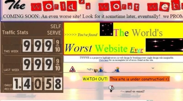
Enjoy every web designers nightmare in the form of an actual website.
Know of any new design trends or have any thoughts on this article? Please comment below, I would love to hear from you!
19 June 2015


